Avoid Component’s boolean props in Figma
- Published
- 2022-05-12
- Tags
- Design SystemsFigmaAPIComponents
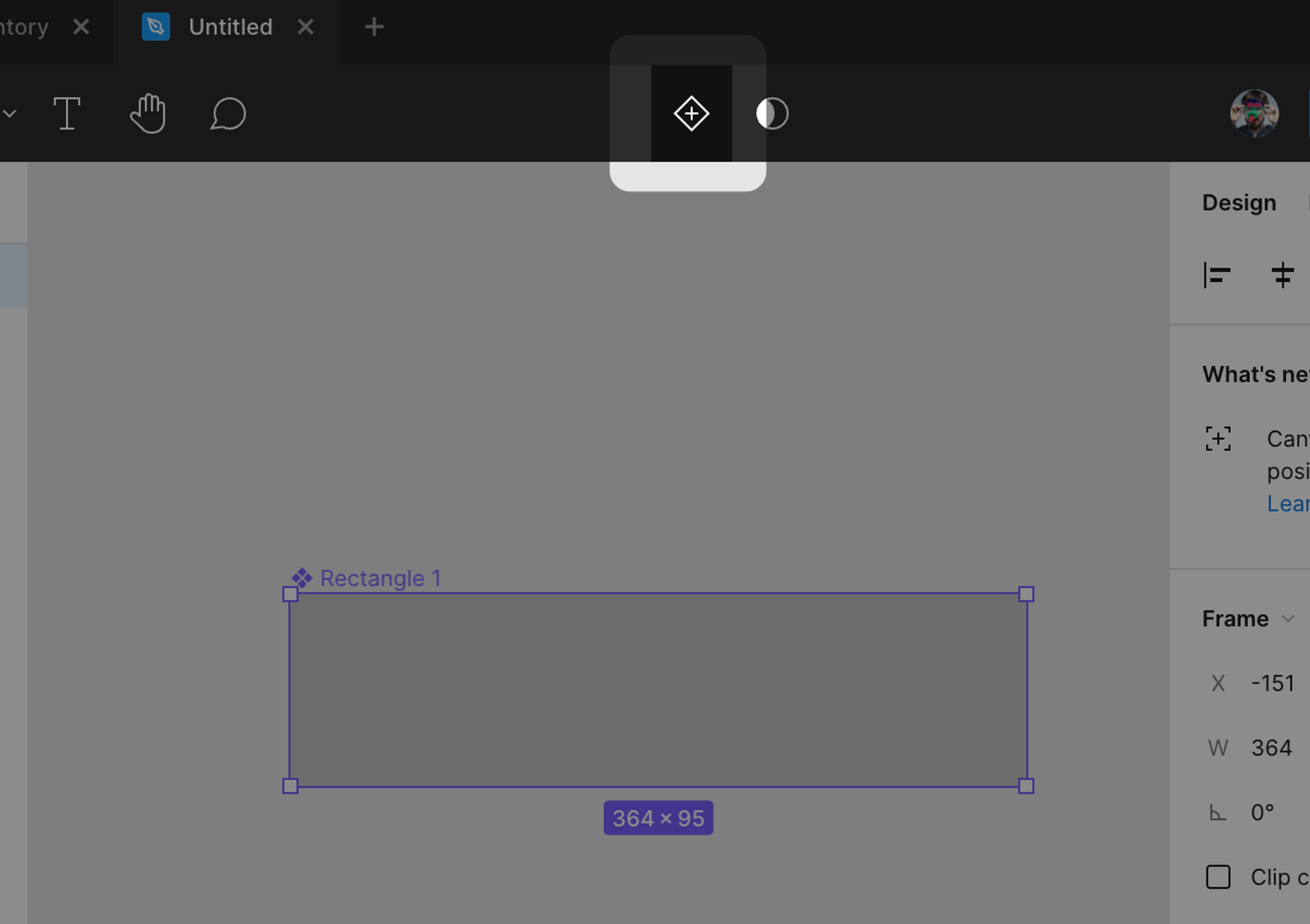
Recently Figma released a big update introducing component’s props that cause a lot of people sharing screenshots of their props. Specifically, what caught my attention was a big hype about boolean props since they “eliminate a lot of maintenance work” for designers. The problem I saw with some of those screenshots is that those boolean props were mis-used.
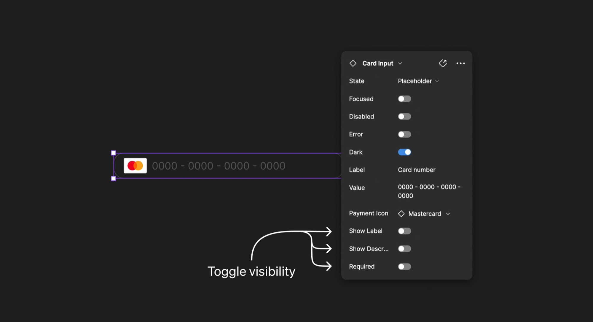
For example, when looking at the above screenshot I kept wondering: “how can an input field be in both disabled and focused states?”.
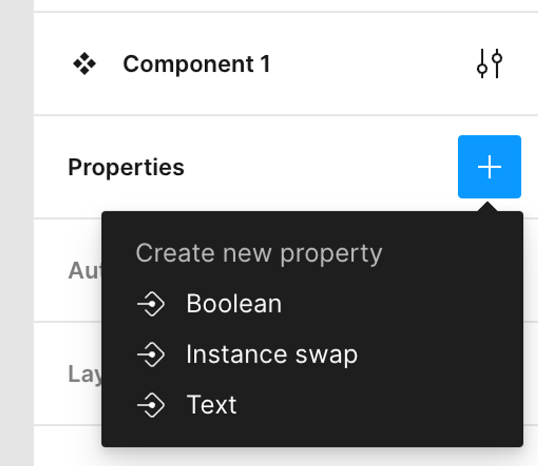
I decided to try out this new feature in Figma. I went straight in creating a new component called “Button” (because Buttons are simple, aren’t they 😅?). After discovering “Properties” in the sidebar, I was presented with a list of 3 items: Boolean, Instance swap, and Text.
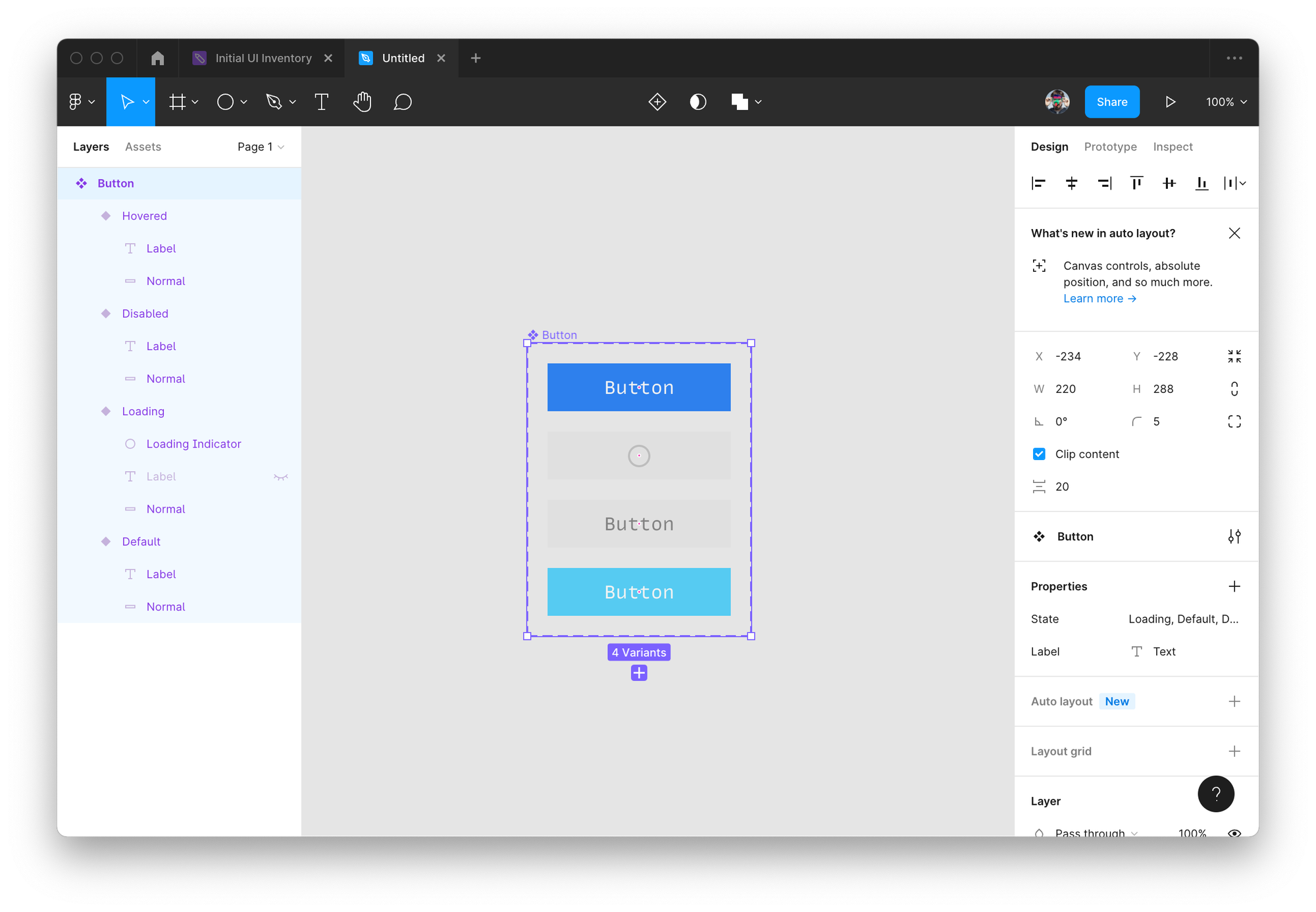
Without much of a choice, I started to model my Button API adding a few boolean props to represent the button in different states: disabled, hovered, loading and one text prop for the label.
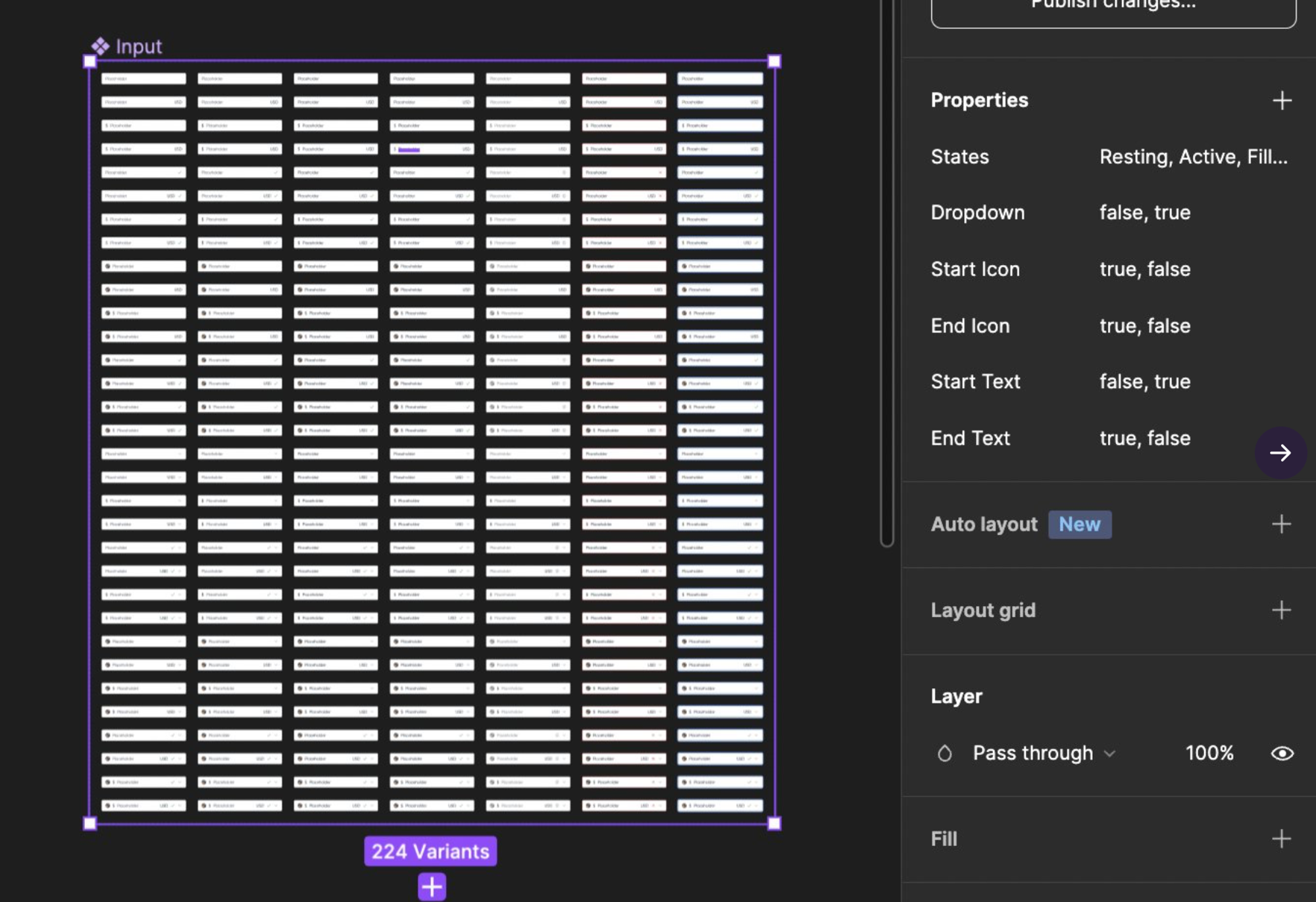
After props were added, I started tweaking the initial Button. In order to make the label not visible in the loading state, I had to add another boolean prop called normal since there is no way to express a negation (don’t show the label when loading is “on”). So, for my simple example, I ended up with 4 boolean props and one text prop. Most folks would think that this amount of boolean props will result in 4 different variation of the component:
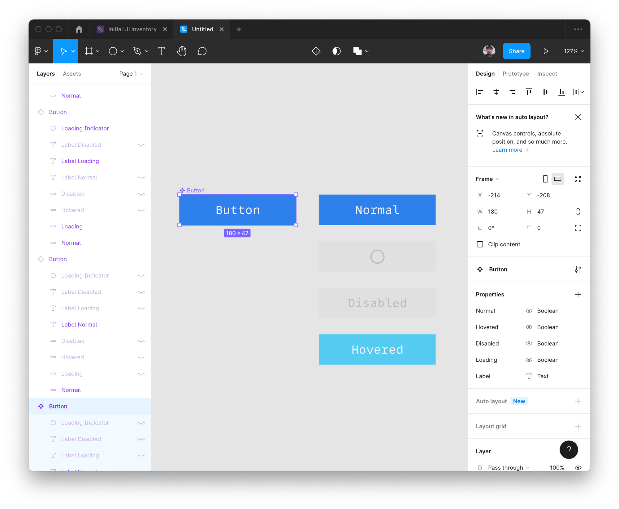
In reality, though, every boolean prop can independently be represented with 2 (”on” and “off”) states making it not 4 but 16 variants!
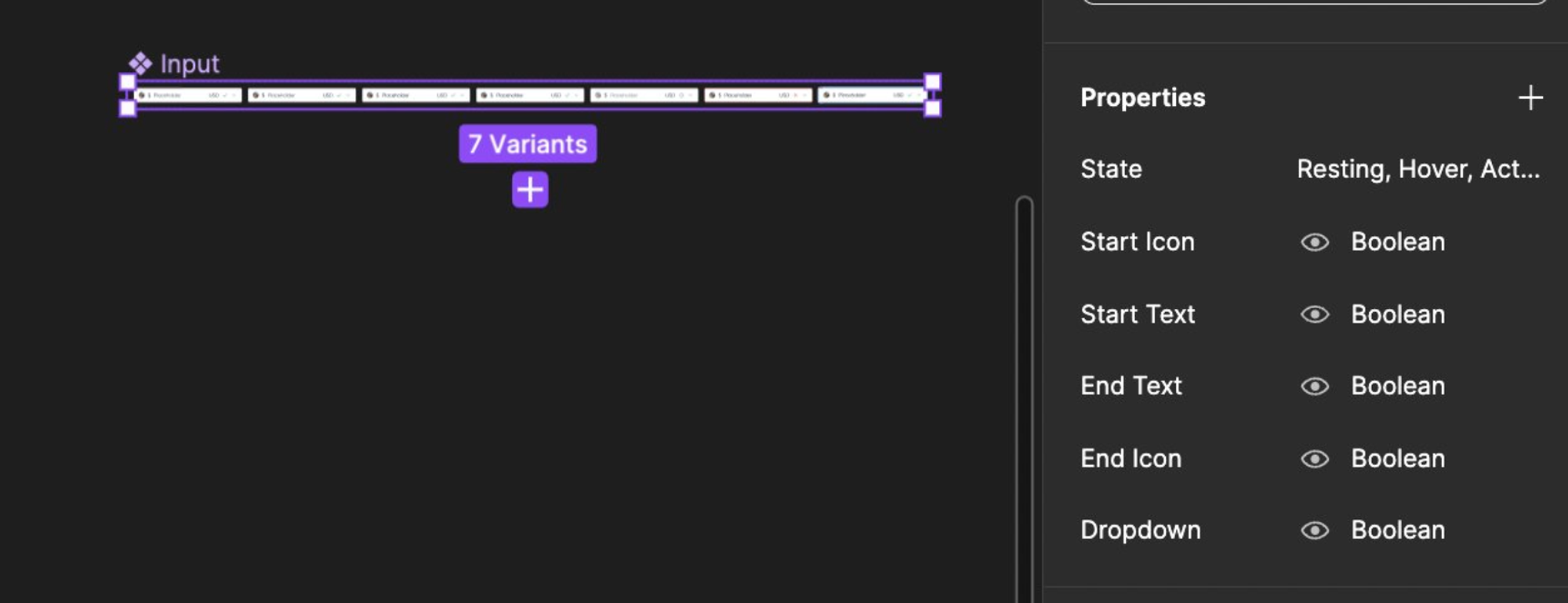
This didn’t make any sense to me, since what I really wanted was a set of mutually exclusive states i.e. variants. I went to Figma documentation and discovered that there is indeed a fourth type of prop called “variant” which is well hidden in the UI:
After finding this and re-modeling the component, I ended up with a component that had all of its states presented as variants:
So, here is a simple advice:
When modeling components (doesn’t matter if it’s in Figma or in code), before you reach out to a boolean prop, ask yourself if it applies to the combination of all other props.
If all you want to model a required props for an input field, since both optional and required fields can be in all other states of the component, then you’re good to go with a boolean prop.
Most of the time, though, you want to use a variant to avoid impossible states your component might end up when used (like being focused and disabled at the same time).
One thing to consider is also how your component will change over time. Like in the original tweet, consider dark prop. It makes sense now since your design system has only two themes. But what is going to happen when you decide to introduce a high contrast theme? Would you add a highContrast Boolean prop? Creating a prop called theme from the start will help in the future to add as many themes as you wish without breaking your component’s API.
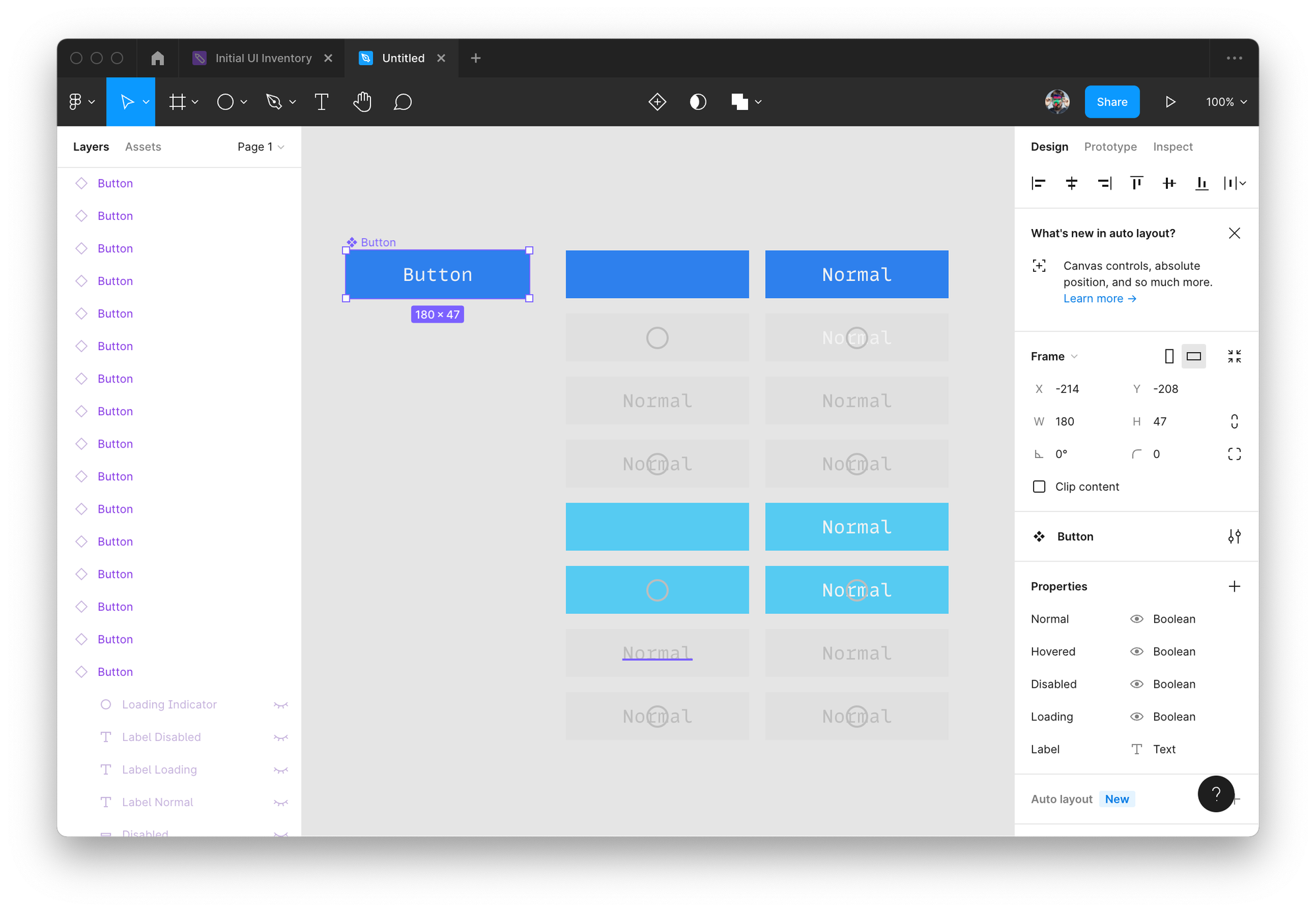
Another drawback of the current implementation of boolean props is that they aren’t visible on the canvas showing only a small sub-set of component’s possible states:
As you can probably see, the complexity didn’t go anywhere. A component still can be in all those states from “before” but now as a designer you might think there are only 4 states from “after”.
I hope Figma will improve the UI to guide designers to better component APIs, avoid logical mistakes, and reveal instead of hiding all possible states of the component. And always think twice before you introduce a boolean prop when modeling your API.